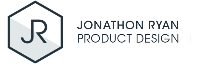
My team at IBM Watson Health identified a need for a well-defined end-to-end process for creating consumable data content that answered customers' top business questions and supported their decision-making. I researched and designed a toolkit based on the team's experiences with dashboard design and the Design Thinking methodologies utilised from planning to wire-framing and prototyping dashboards.
Dealing with complex healthcare data, it is important when designing dashboards to be able to understand the business objectives, the questions that need to be answered, the data sources available, and the standard measures and metrics customers need to see. Using a structured Design Thinking methodology, the toolkit establishes a framework to map these key requirements and find visual solutions to display the information and answer customer questions.
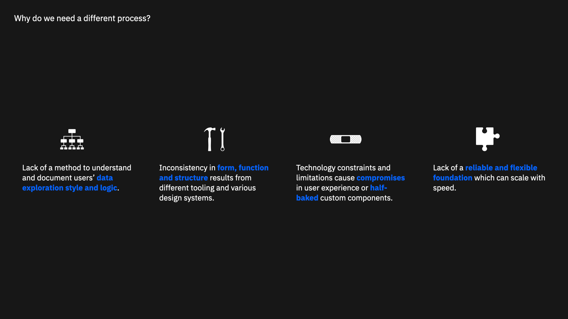
I established a Hill (project outcome) from the outset of who the framework was for and what it would achieve. The challenge presented itself in understanding a designers behavioural model. Designers have a lot of options available for data visualisation - charts, data, layout, templates, software. At what point do they start designing data visualisation and how do they know what information to present that might be beneficial to their audience? A standard process that focuses on the audiences goal and builds the visualisation in stages was proposed to address the challenge.
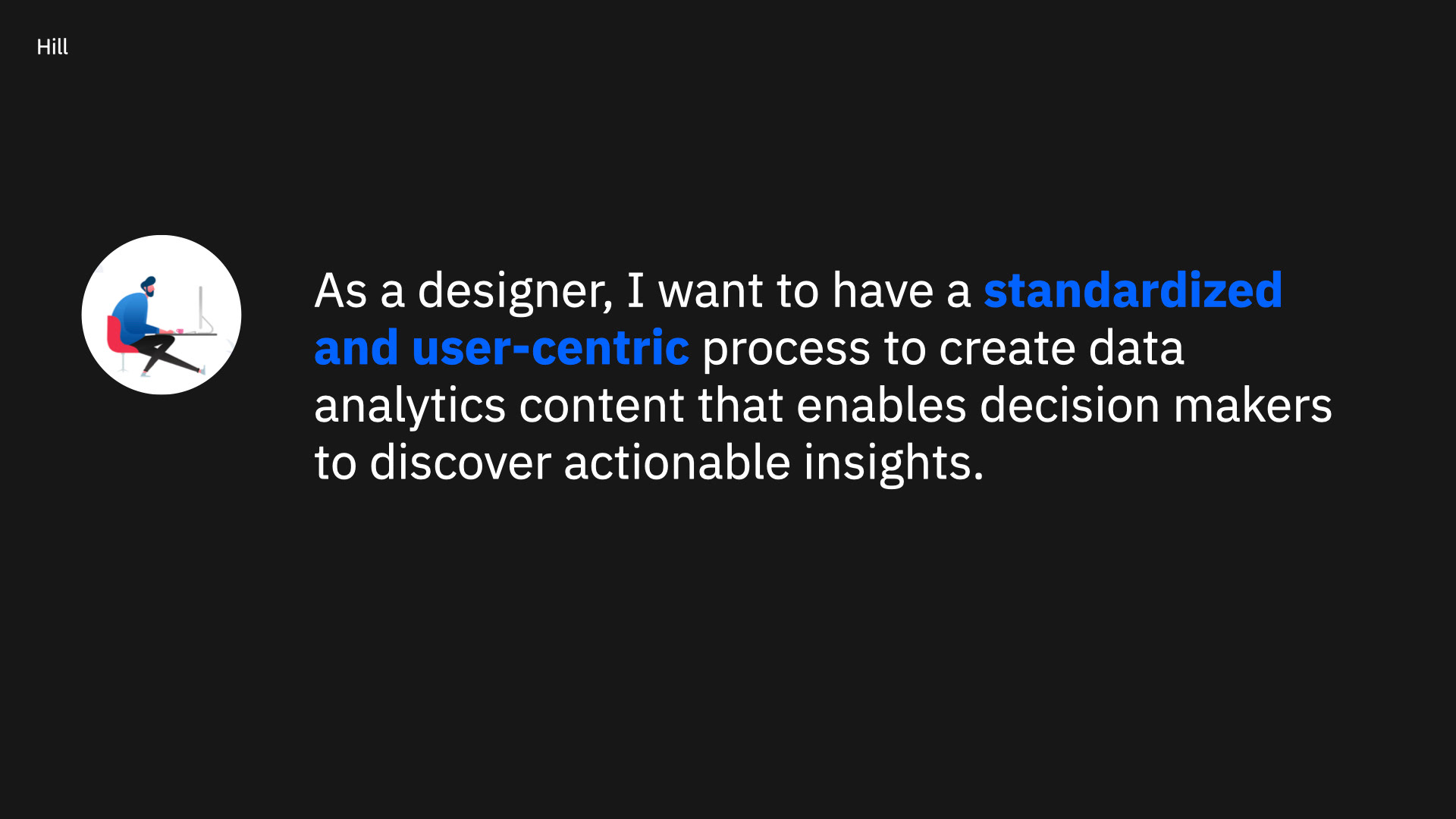
Based on mine and the teams experience of researching and designing dashboards for Program Managers and Data Analysts the toolkit was specified for use when designing for this persona archetype.
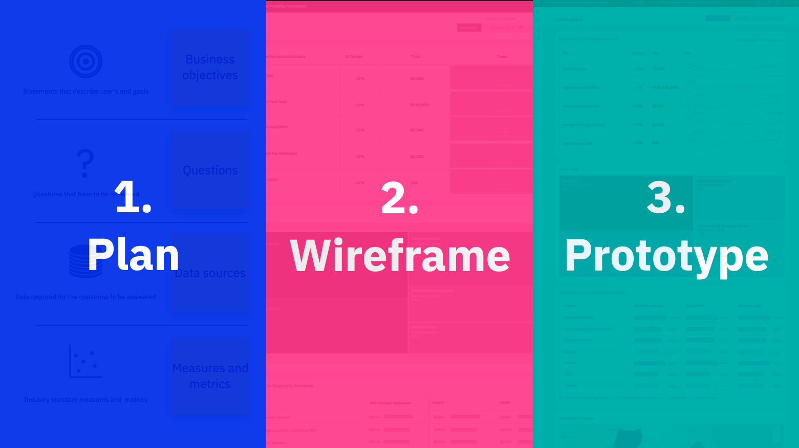
I broke the process down to 3 distinct phases.
Plan: Understand user needs through various user research activities. Use a template to document users’ mental models and decision making process.
Wireframe: Translate user needs into business requirements. Define the basic functions and chart essentials. Validate data content through multiple round of user testings.
Prototype: Assemble interfaces and test data visualisations and interactions with users and data specialists.
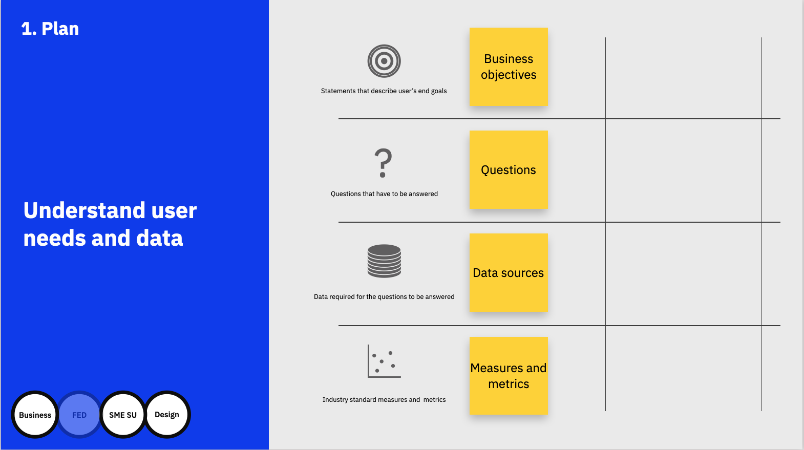
The template could be used to define and understand users’ top needs. What are the top business questions that need to be answered? What business decisions that can be answered with the data on hand?
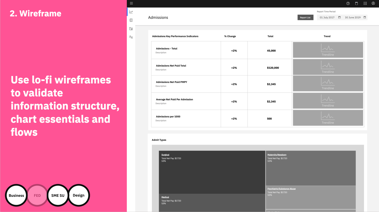
Wireframes are outlines of the data stories we are creating. We can use it to decide on the placement of information, the correlations of data, all the attributes that constitute a chart or a data visualisation, and how users can navigate through different dashboards and reports.
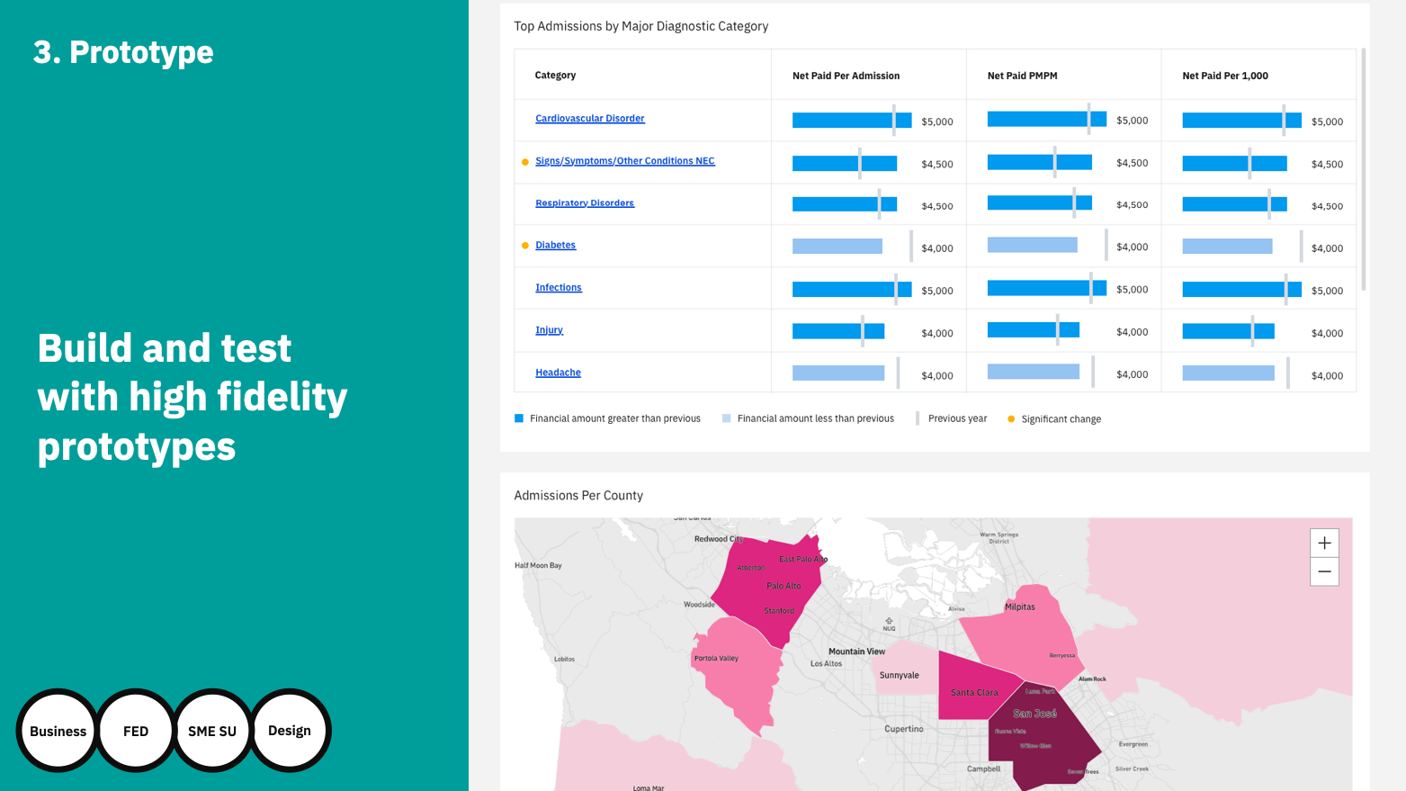
Following the Planning and Wireframing stage of the process we move into the building and testing of the high fidelity charts and prototypes. This iterative design process involves all arms of the team from business, FED, SME and design.
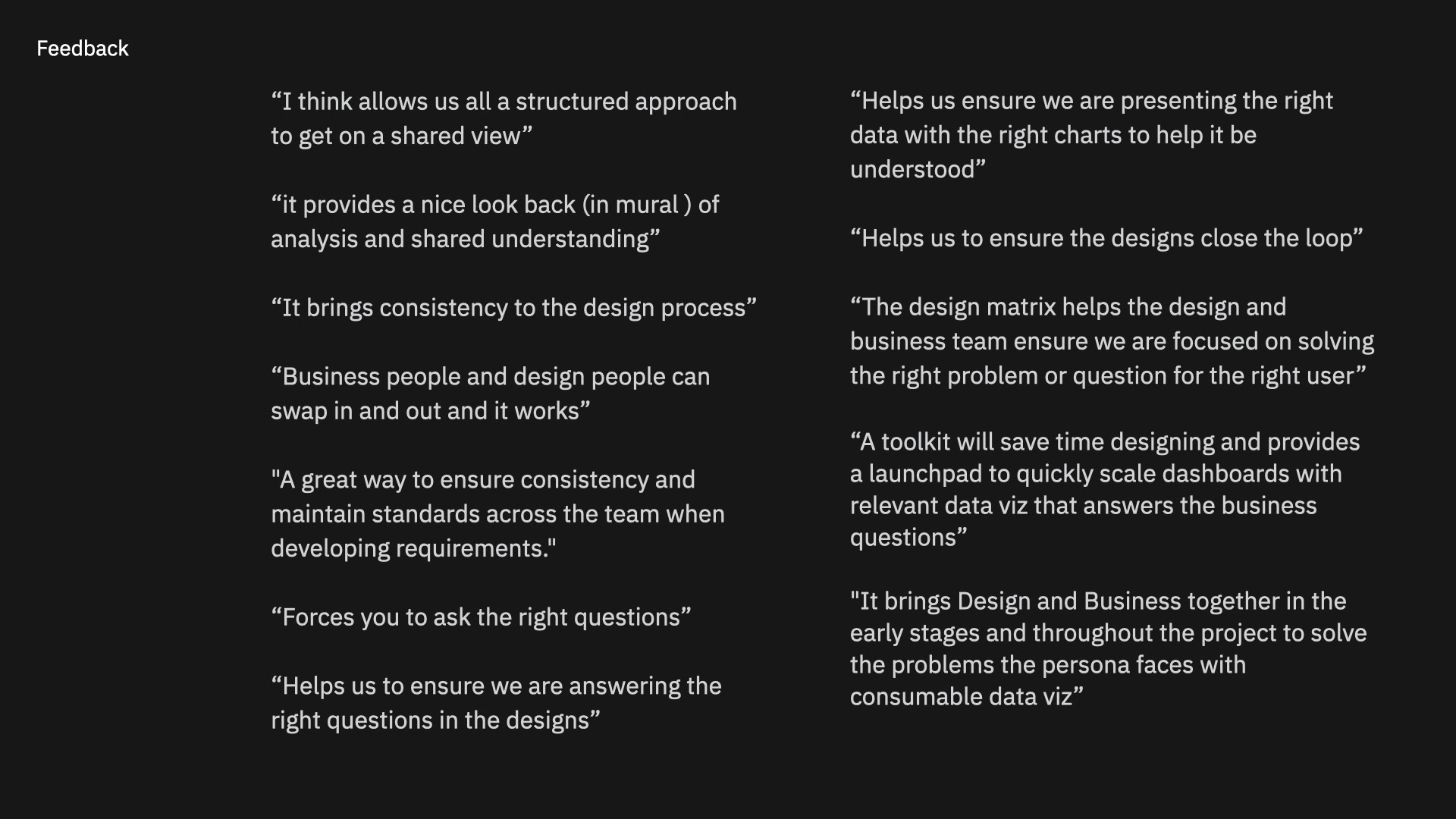
I collected user feedback on the toolkit and process from business and designers. Business and design have found the process valuable for establishing the user story and questions to be answered. It allows the business and design teams to communicate effectively through the process, always referring back to the problem question. For design it allows a platform to launch quickly from, with the story and business questions available form the beginning the PLAN phase acts as the data visualisation building source through the process.
The toolkit has been leveraged by a number of teams within IBM in Ireland, Spain and India. It has served as a launchpad to quickly scale dashboards with relevant data viz that answers the business questions. It has been shown to bring Design and Business together in the early stages and throughout a project to solve the problems a user faces with consumable data vizualisation.
The process is somewhat light on detail and examples of taking business objectives, questions, data sources and metrics based on what I can share publicly. If we meet in person or remote, I’d be happy to go into a lot more detail on my process.