
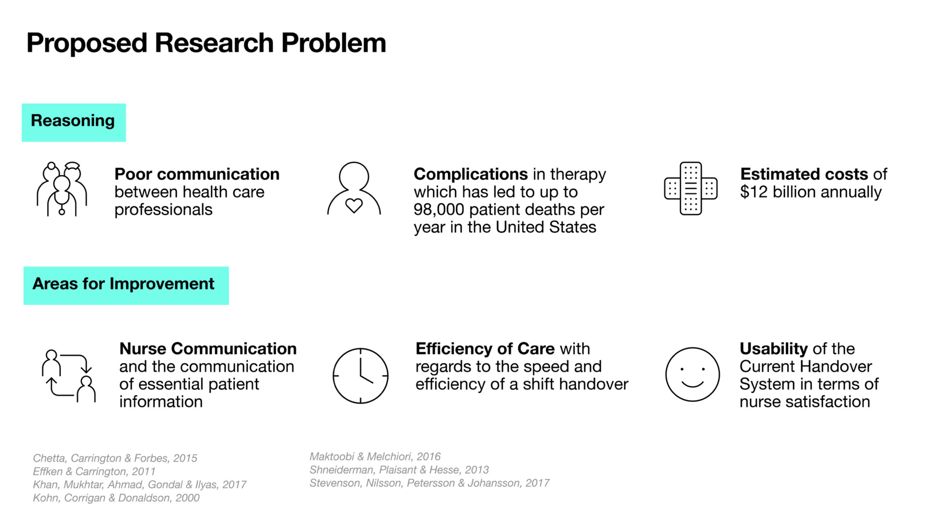
Data Visualisation is prolific across business and science but is less utilised in healthcare settings. Poor usability is cited as the major prohibitor within digital healthcare systems and is particularly evident in patient documentation and nurse handover processes (Khan, Mukhtar, Ahmad, Gondal, Ilyas, 2017). This project documents the empathetic research and design of the nurse shift handover using a user-centred design process. Grounded in discovery research, the project demonstrates the pitfalls of current shift handover methods. The project illustrates how the use of a digital data visualisation dashboard to view, record and store patient information will improve communication, efficiency and overall satisfaction in nurse shift handovers.
Secondary research was conducted to inform the design process in the form of a Literature Review and Competitor Analysis. Based on the findings three areas of focus for improvement were established: the communication, efficiency and satisfaction of the nurse shift handover.

Primary research using remote qualitative discovery interviews took place with 5 nurses who were recruited by word of mouth. Their roles varied from junior to senior roles across a number of wards. Discovery interviews were used in the early stages to provide insight into what nurses think about the current handover process and the challenges that they face (Pernice, 2018). Thematic analysis was used to group responses into themes related to the research questions (Braun & Clarke, 2006). The responses for each question were read through in detail for each participant with interesting statements highlighted in the online tool Miro. A Quantitative/Qualitative survey was also created and distributed online to gain attitudinal insight. The survey results show that verbal and written methods are used mostly for shift handover in public hospitals while 53% of respondents in private hospitals use audio recordings. 55% of respondents were satisfied with their current process. Of concern is that only 55% of respondents have confidence in the information they provide while just 45% have confidence in the information they receive.
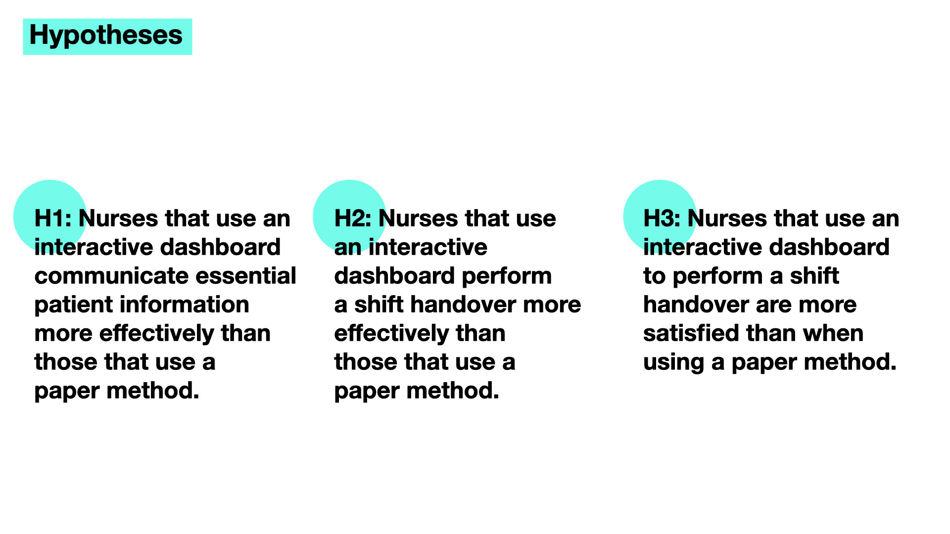
The hypotheses state that nurses who use an interactive dashboard to communicate essential patient information, perform a shift handover more effectively and are more satisfied than when using a paper method.
The interviews and online questionnaire allowed for the creation of Empathy Maps to visualise the user needs. Personas were created to represent two of the key user demographics, senior nurses with over 10 years experience and junior nurses with less experience.
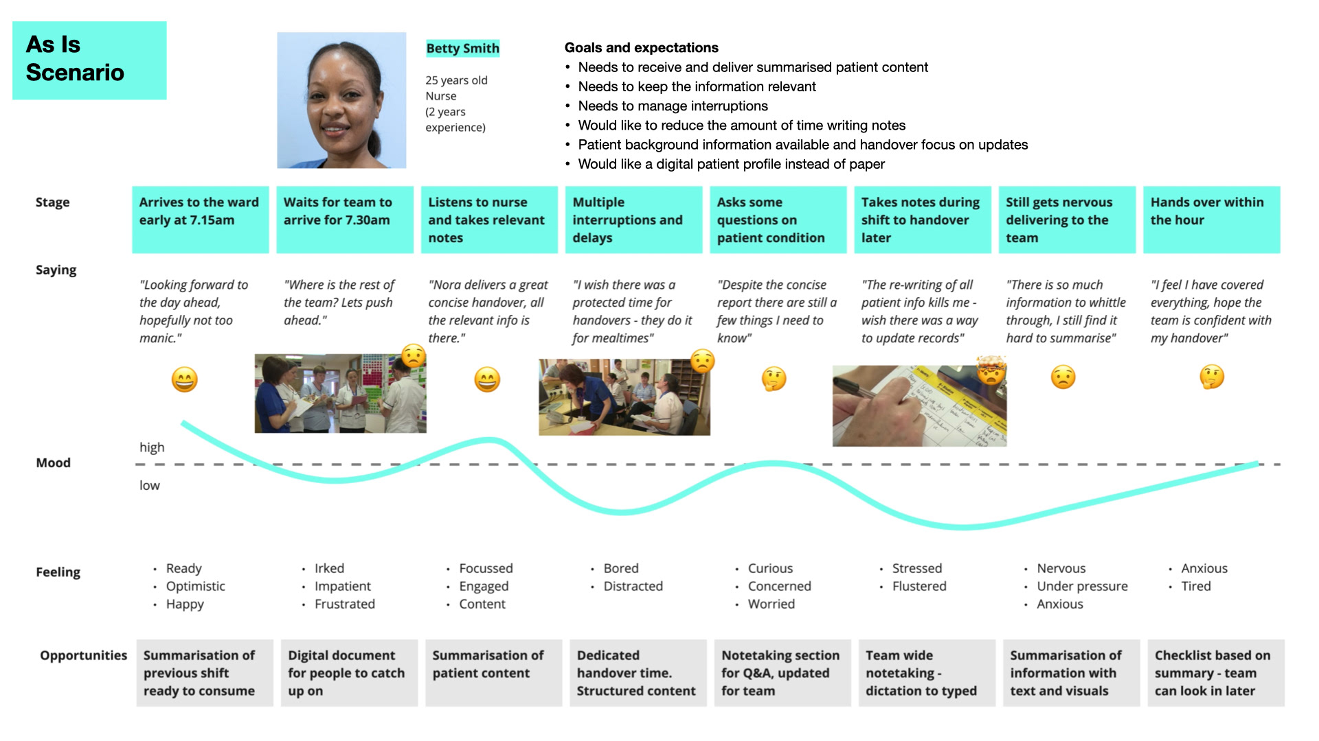
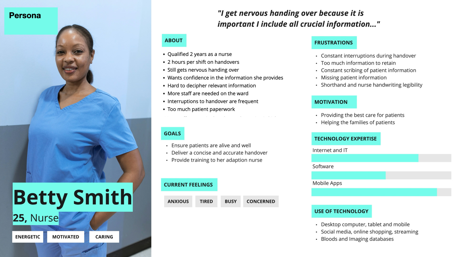
Journey maps show the ‘As-Is’ scenario our personas currently face. Based on the accounts provided by the nurses interviewed, a scenario was created for the senior and junior nurse personas. Betty's As Is Scenario sees her listening to the Senior Nurse Nora deliver the morning handover and takes note of the key information. Betty works through her shift and when she gets a chance updates her nursing notes. Her notes help her deliver a full shift handover that evening, she still gets a bit nervous and needs to include all the correct information. Betty's pain points include delays, lack of summarised content, Interruptions, a lot of paperwork and handwriting, confidence in information handed over and received.
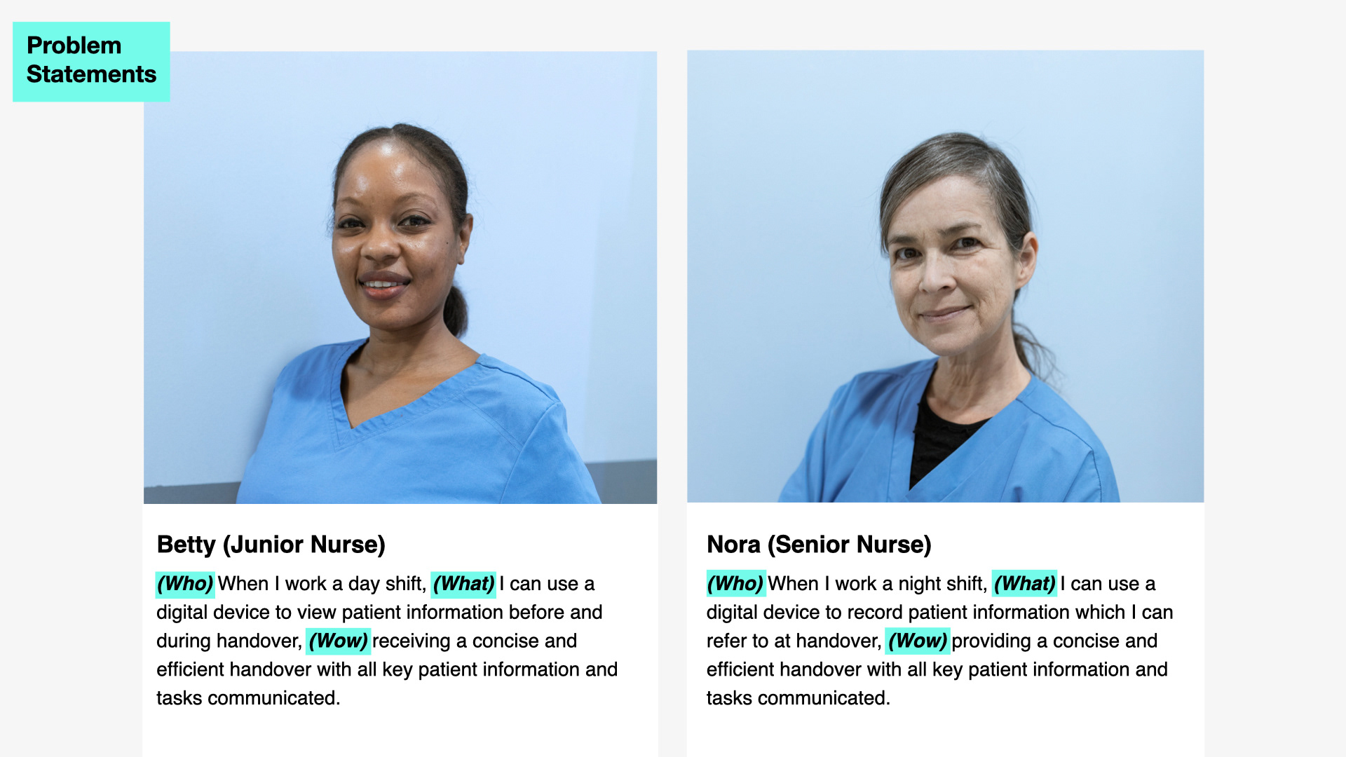
Problem statements were drafted for each persona to identify the gap between the current paper handover process and the improved digital handover process. For Betty she needs to be able to use a digital device to view patient information before and during handover, receiving a concise and efficient handover with all key patient information and tasks communicated.
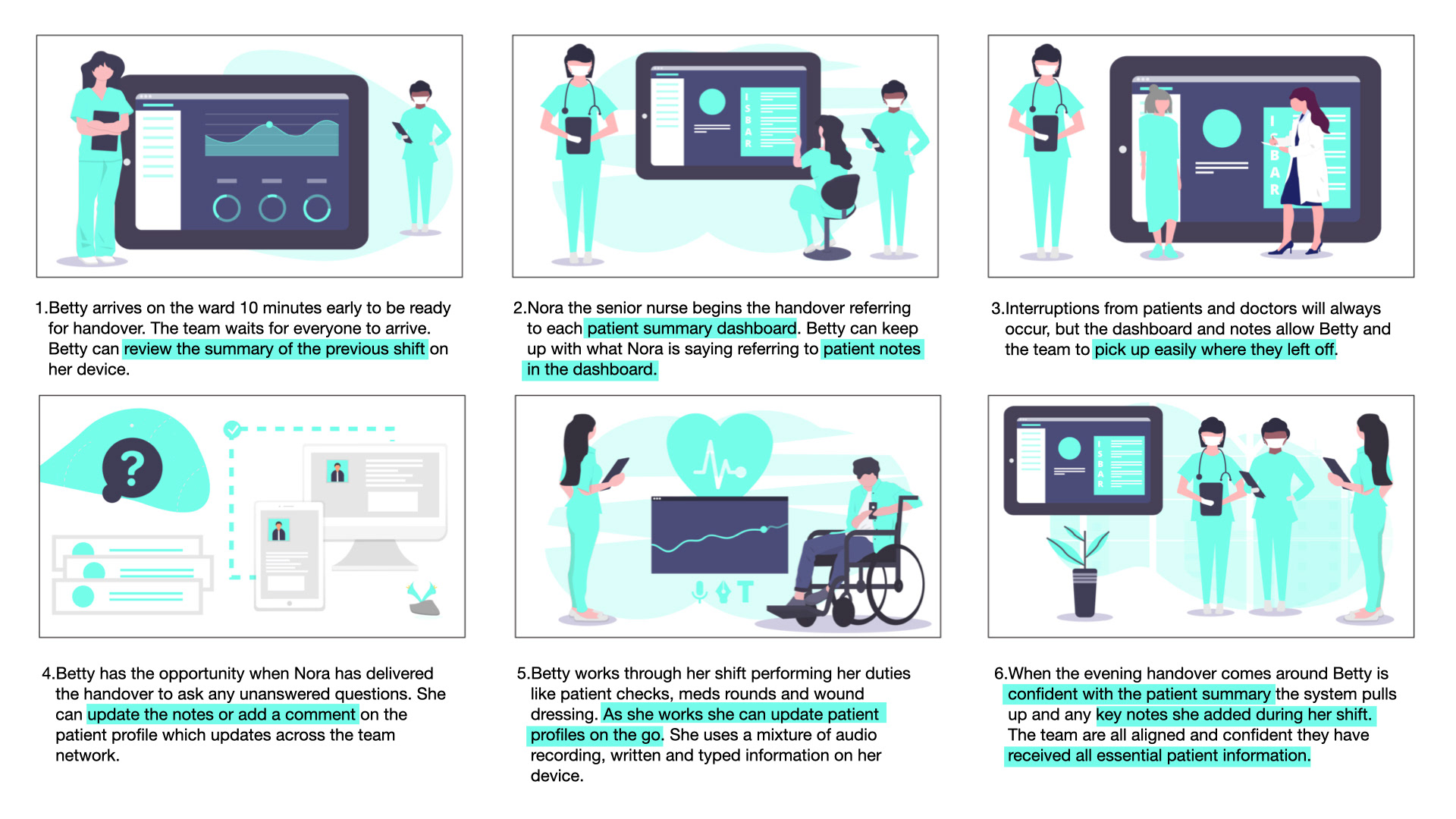
Storyboards show the ‘To-Be’ scenario both personas would ideally encounter at the end of a shift and the beginning of a new shift. A storyboard was created for each persona based on the wants and needs of the nurses interviewed and responses in the online questionnaire. Betty’s To Be Scenario sees her able to review the summary of the previous shift. She can refer to the patient summary dashboard and patient notes. The structure of the dashboard allows the team to pick up easily following interruptions. Betty can update notes and leave comments and update patient profiles on the go. At the end of her shift she is confident in the information she delivers to the team.
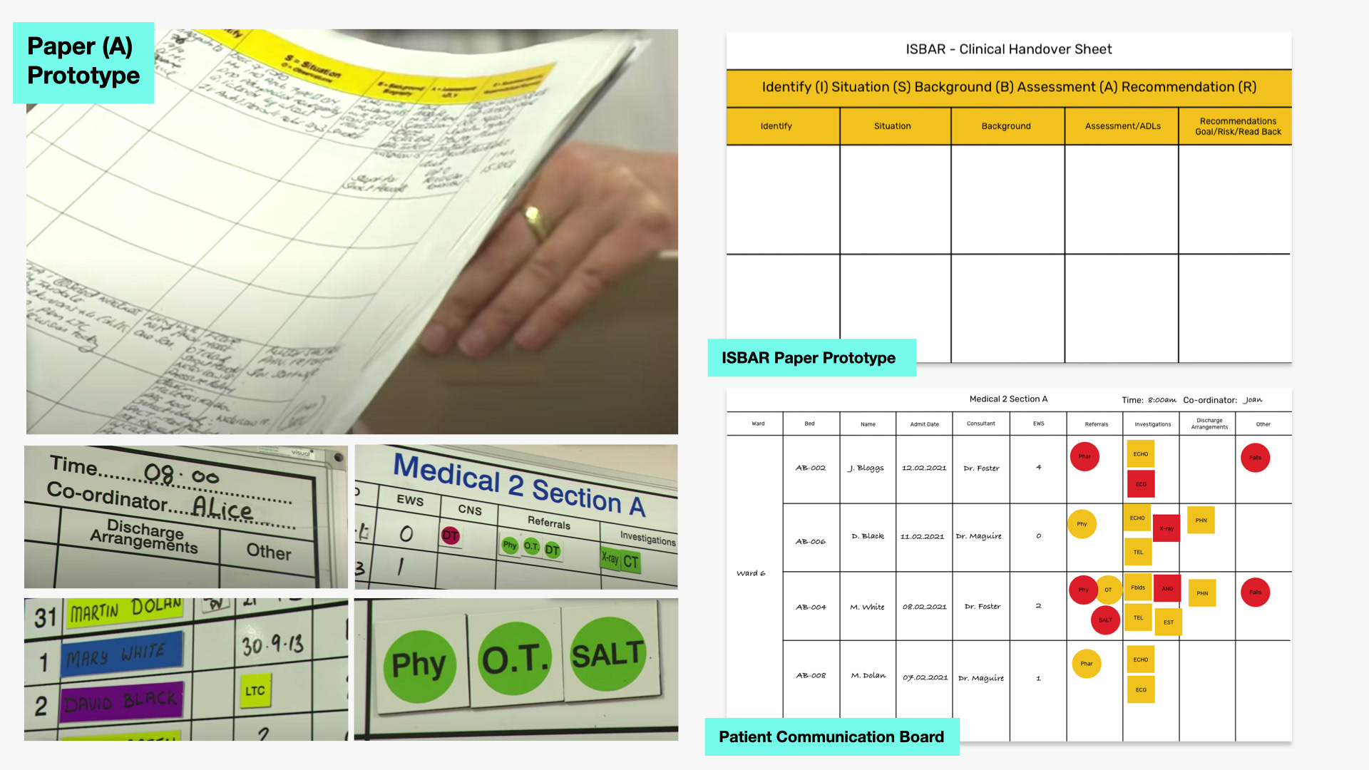
The final phase of the study saw the recruitment of 16 nurses for a final A/B test of the hi-fi digital prototype alongside the paper prototype. The test involved participants listening to a simulated handover and recording the information in a paper and digital prototype. The ISBAR Paper Prototype and Patient Communication Board were designed in a digital template for remote testing purposes. Participants drew a grid on a blank piece of paper with the ISBAR headings for prototype A of the test.
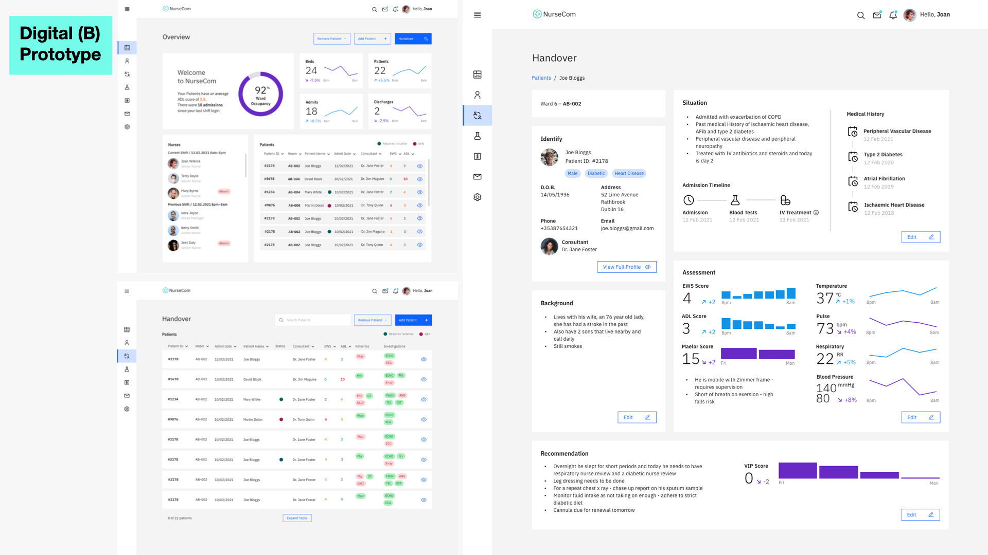
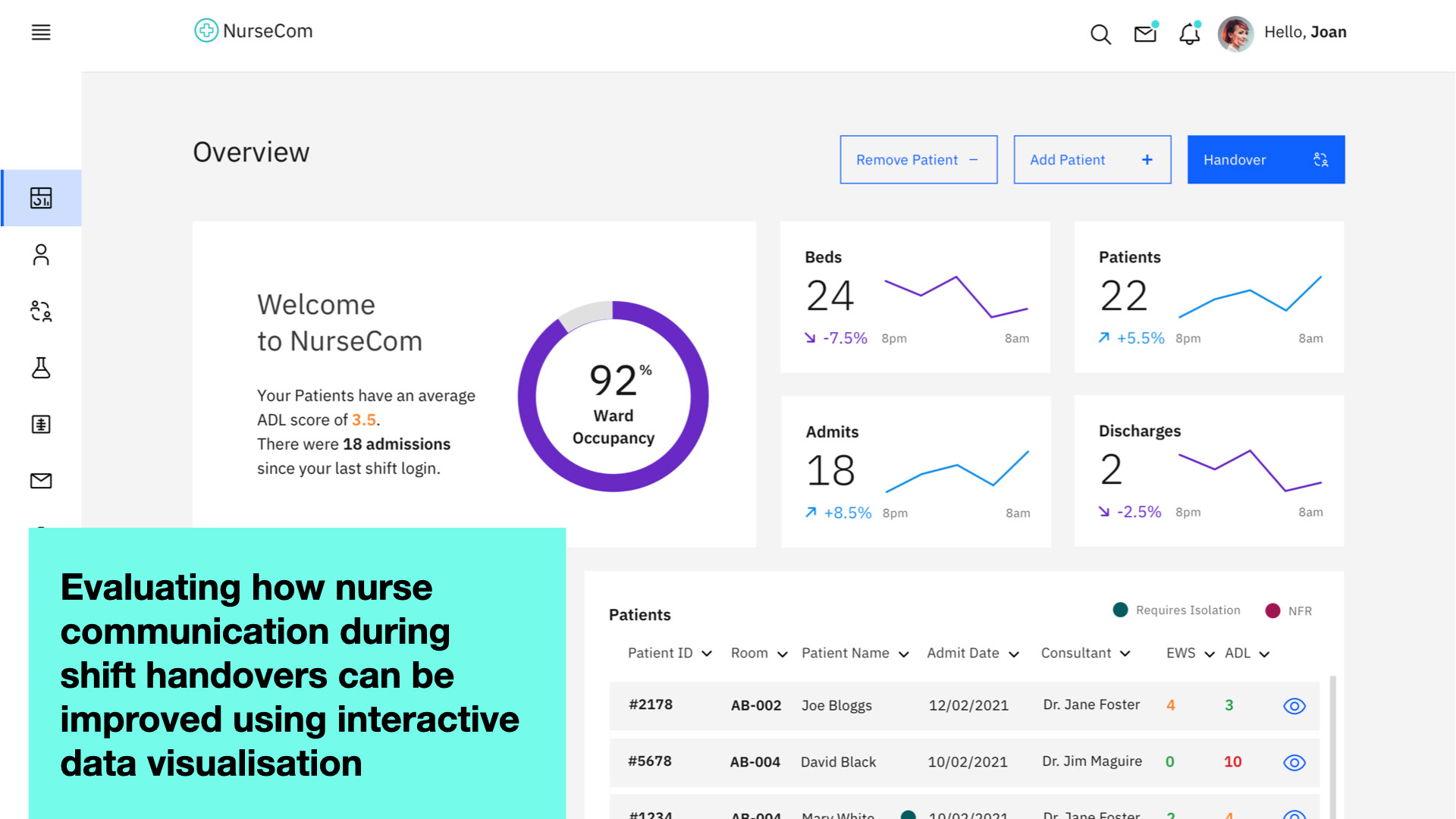
Paper and mid-fidelity prototypes and testing led to an iterated final hi-fidelity artefact which provided a ward overview, handover overview and patient handover page. A Remove Patient button was introduced based on feedback along with colour coding for scores, infection status, and the addition of consultants on the Patients section. Timelines on the patient handover page were changed on some scores to a 12-hour range to track the frequency of recording based on feedback.
Walkthrough of the prototypes for the A and B part of the experiment.
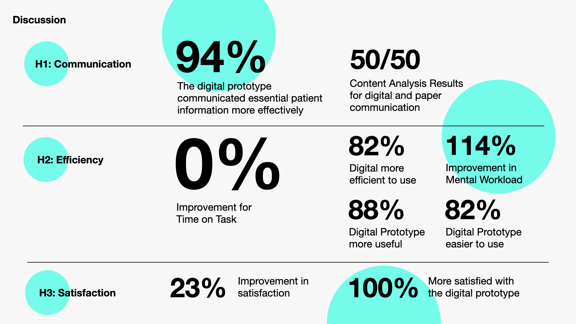
Findings indicated that though the digital prototype was slower on time on task participants found it more efficient and it performed better in terms of communication and satisfaction. The study has illustrated that the use of a digital data visualisation dashboard to view, record and store patient information can improve nurse shift handovers in the communication of essential information, the efficiency of a handover and the overall satisfaction with the shift handover process.